
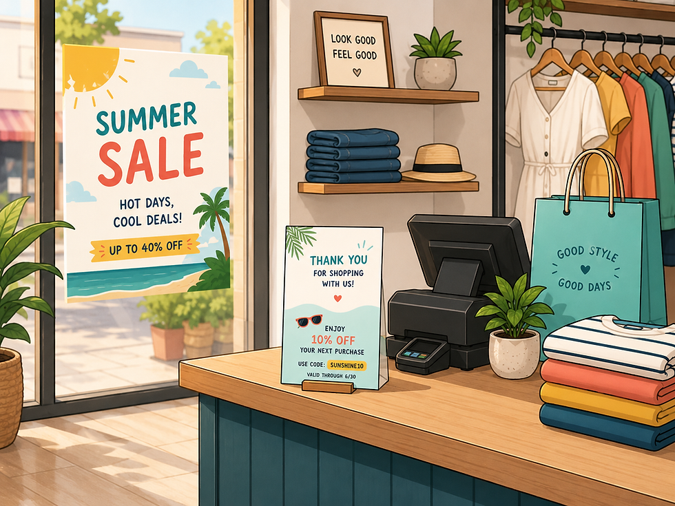
Planning a Summer Promotion? Turn Your Idea Into Print
- 1 day ago
- 5 min read

You’ve got a weekend sale coming up in three weeks, and nothing has been printed yet.
Maybe the new summer arrivals are already on the floor, but there is no signage drawing attention to them. Or the seasonal inventory that needs to move is still sitting there, waiting.
This is where many small business owners get stuck. Not because they do not have a promotion idea, but because the gap between having an idea and holding a finished printed piece feels bigger than it is.
It does not have to be.
Start With What You Want Customers to Do
Before design, paper choices, file formats, or print specs, get clear on the customer action.
What do you want someone to do after they see the piece?
A clothing store clearing summer inventory needs something different than a café promoting a seasonal drink. A fitness studio advertising a July membership offer needs something different than a local service business trying to stay visible while customers are out and about.
The printed piece should match the goal.
Summer Promotion Goal | Printed Piece That Fits |
Promote new summer arrivals | Window poster, rack card, postcard |
Clear older seasonal inventory | Sale flyer, counter card, sidewalk sign |
Bring shoppers back in July | Bag insert, bounce-back coupon, loyalty card |
Promote a weekend sale | Window poster, flyer, postcard |
Support a sidewalk sale or pop-up | Flyer, poster, invitation card |
Highlight a new product | Product card, insert, small brochure |
Reach nearby customers | Neighbourhood postcard, flyer, or door hanger |
Each format has a different job.

A postcard needs a clear headline and a reason to act. A bag insert needs to be simple enough to read quickly. A rack card can carry more detail because the customer chose to pick it up.
Choosing the right format before designing saves a lot of rework.
You Do Not Need Finished Artwork to Get Started
This is the part many business owners do not realize.
Some clients come to CETTEC with a print-ready PDF. Others come with a logo, product photo, rough Canva layout, old sample, or a few notes about the offer. Both are workable starting points.
If your file is already built, we can review it for print setup. If the idea still needs design work, we can help coordinate graphic design support. Our designer works with clients remotely to shape the message, build the layout, and prepare the file for production.
Useful things to gather before reaching out:
Your logo
Product or store photos
Brand colours or fonts, if you have them
A rough headline or offer
Promotion dates
Coupon, contact, or QR code details
An old flyer, card, poster, or brochure as a reference
A Canva file or draft layout, even if unfinished
Your website or social media page
You do not need to know the print terms. You just need to know what you want the promotion to do.
Choose the Format Before You Design
One of the most common mistakes is designing first and deciding the format later.
A graphic built for Instagram rarely translates cleanly to a flyer. A horizontal layout may not fit a rack card. A poster won't convert directly to a postcard without a rebuild.
Decide where the piece will live before the design starts.
In-store pieces — counter cards, rack cards, bag inserts, shelf talkers, coupon cards — need to be clear and easy to act on. A window poster for a weekend sale and a bag insert offering a July discount are two different jobs. They shouldn't automatically share the same layout.
Customer takeaway pieces — postcards, loyalty cards, coupon cards — need to survive handling. Cover stock holds up better than lightweight paper, and it feels more substantial in a customer's hand. If the piece is meant to stay in a wallet or shopping bag, paper weight matters more than most people expect.
Local outreach pieces — neighbourhood flyers and postcards — need to make the offer clear in a few seconds. Headline, date, location, call to action. Too much text works against you.
When DIY Design Works — and When It Does Not
Tools like Canva, Adobe Express, or Affinity are genuinely useful for getting a promotion started. They work well for simple flyers, basic postcards, event handouts, and one-sided promo cards.
The limitation isn't the tool. It's that a file can look great on screen and still need print setup before it's ready for commercial printing.
Design support makes more sense when the piece needs clearer messaging, stronger layout, or brand consistency — especially for folded brochures, product cards, menus, multi-piece campaigns, or anything that needs to match existing brand materials.
When design and print work together from the start, the final piece tends to be cleaner, more practical, and faster to produce.

What Gets Checked Before Printing
A good promotion design also needs to be production-ready. These are the details that are easy to miss on screen but show up in the finished piece.
Bleed — when colour, images, or backgrounds run to the edge, the artwork needs to extend beyond the trim line so there is no white edge after cutting. A common starting point is 0.125 inches, but the final spec should match the job.
Safe margins — important content like text, logos, QR codes, pricing, and contact details should sit comfortably inside the trim edge. A practical range is usually 0.125 to 0.25 inches, depending on the piece.
Image resolution — a product photo may look sharp on a phone but print soft if the resolution is too low. For most marketing materials, 300 dpi at final print size is a common benchmark.
Colour expectations — colour can change depending on the file, paper type, coating, toner or ink coverage, and finish.
Fold-and-score setup — brochures and folded cards require proper panel sizing. Heavier stocks may need scoring so the fold looks cleaner and cracks less.
PDF setup — the final file needs to match the production method, size, bleed, and finishing requirements.

These checks are not there to slow things down. They help prevent reprints.
Paper and Finish Matter More Than People Expect
The material should support the message.
A quick handout flyer doesn't need premium stock. A postcard for nearby shoppers feels more credible on heavier cover stock. A coupon card should be durable enough to actually hold onto.
Coated paper gives photos more sharpness and contrast. Uncoated paper creates a softer, warmer look but can reduce colour intensity. Gloss and matte finishes behave differently in handling and under store lighting.
The right choice depends on the promotion, the budget, the quantity, and how the piece will actually be used. We're happy to talk through the options.
A Simple Path From Idea to Printed Piece
Define the promotion — offer, timing, customer action
Choose the format — flyer, card, poster, insert, brochure
Gather what you have — logo, photos, text, old samples, rough layout
Build or review the design — your own tool or design support through CETTEC
Prepare the file for print — bleed, margins, resolution, colour, PDF setup
Choose paper and finish — matched to use, budget, and brand impression
Print and deploy — window, bag insert, counter display, mail, event table
When to Reach Out
Any stage works.
Finished file? We can review it for print setup. Rough layout? We can check whether it's suitable and suggest adjustments. Just an idea? We can help coordinate design support so the piece is built properly from the start.
Most people wait until they feel more ready than they need to be. A clear promotion idea is enough to begin the conversation.
Summer moves fast. The sooner the promotion is out there, the more time it has to work.


